Making digital ordering easy for restaurant operators and their customers
Cinchio / SSA Group
Year
2022-2024
Team
Director of Product Design (me)
VP of Experience
Senior Designer
Designer
Product Manager
Engineers
My Role
As a design lead, I led the design team on all design initiatives and was also hands-on in researching and designing for the guest and operator platforms.
Background
SSA Group works with cultural attractions to enhance its mission by improving food services, retail, and admissions. To stay competitive, they set out to transform their digital operations, focusing on streamlining processes, improving guest experiences, and driving profitability.
This effort began with food services and eventually led to the creation of Cinchio Solutions, a platform designed to support growth in the broader hospitality industry, expanding well beyond cultural attractions.
Problem
Restaurant operators relied on multiple third-party tools to manage digital operations, resulting in inefficiencies, pressure on staff and poor guest experience.
Operators had to create the same menu multiple times—once for the point-of-sale system and again for mobile ordering.
When something went wrong, mobile ordering was often just turned off.
Guests also had a frustrating experience, dealing with clunky interfaces and accessibility issues.
Lack of text notifications when food was ready for pickup resulting in friction between a guest and staff.
Solution
We developed an integrated digital ecosystem that streamlined the restaurant operator and guest experience.
A unified mobile and kiosk ordering experience for guests.
A back-office portal that allowed operators to manage both platforms seamlessly.
40%
Average increase in order value over point - of-sale systems.
90+
Cultural attractions are using the solution serving millions of guests.
88%
Conversion rate from cart to placing the order. This was around 45% with a prior mobile solution.
3
Platforms launched over the course of two years to support guest and operator needs.
Mobile ordering
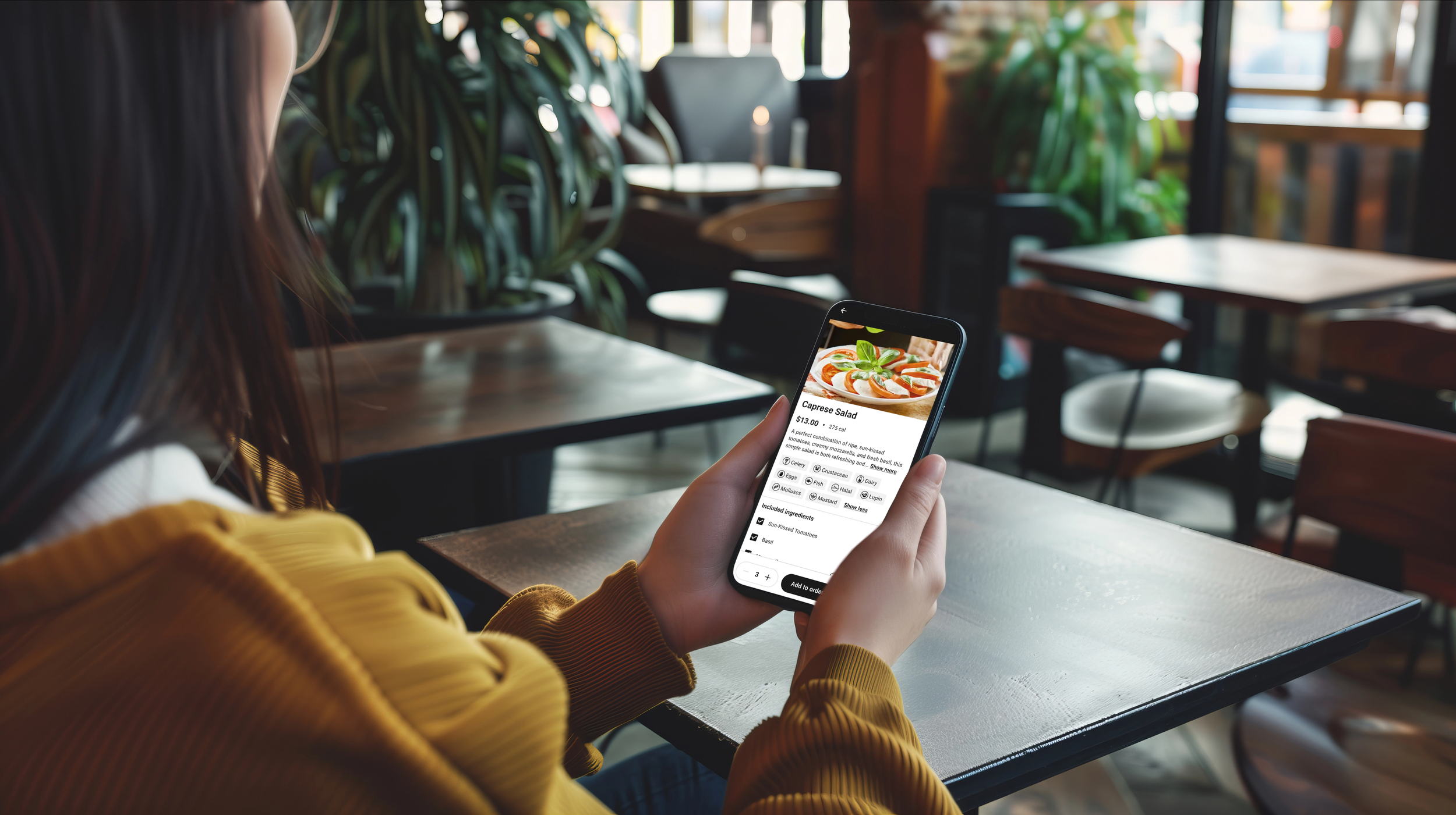
Through conversations with guests and operators, as well as competitive analysis, we discovered some key insights. Operators value having a flexible platform that lets them tailor the menu to meet their needs and the preferences of their guests. On the other hand, guests prioritize ease of use, trust in the brand, and a menu that helps them make confident choices.
With these insights in mind, we created a guest experience that's not only flexible but also a scalable white-label solution. This approach allows operators to seamlessly integrate their branding with minimal effort. For guests, the menu is designed to be user-friendly, featuring allergen details, customization options, and enhancements to make browsing simple and intuitive.
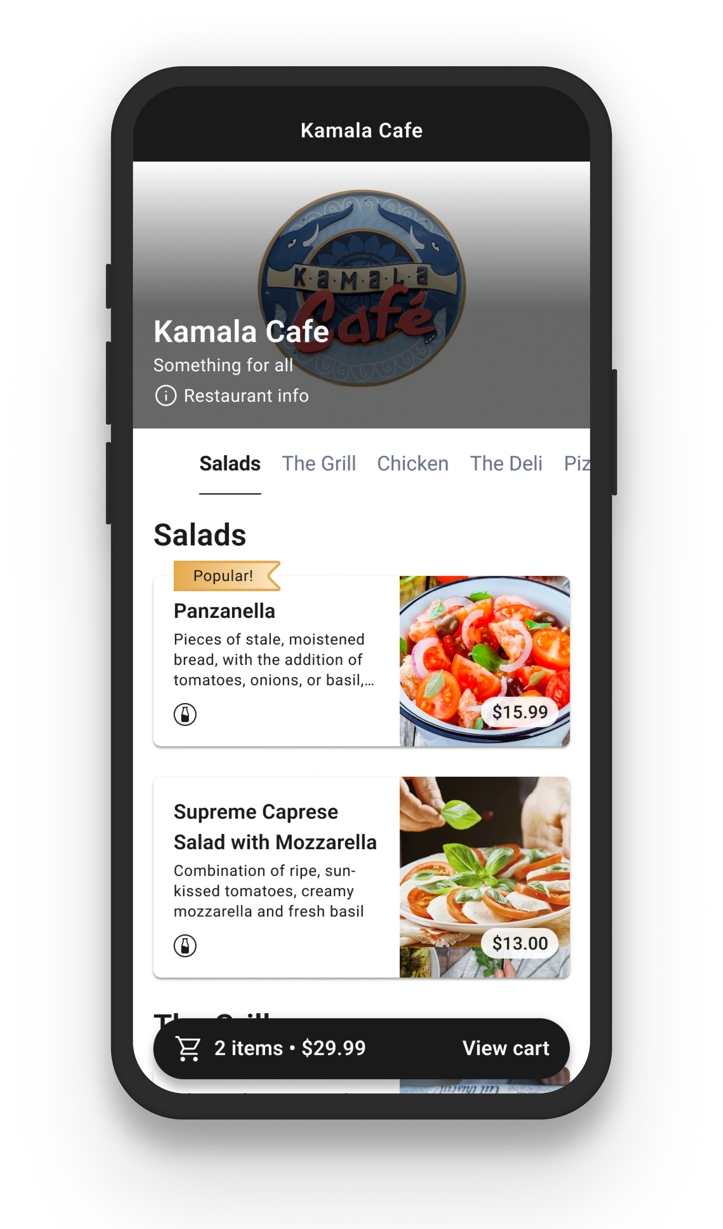
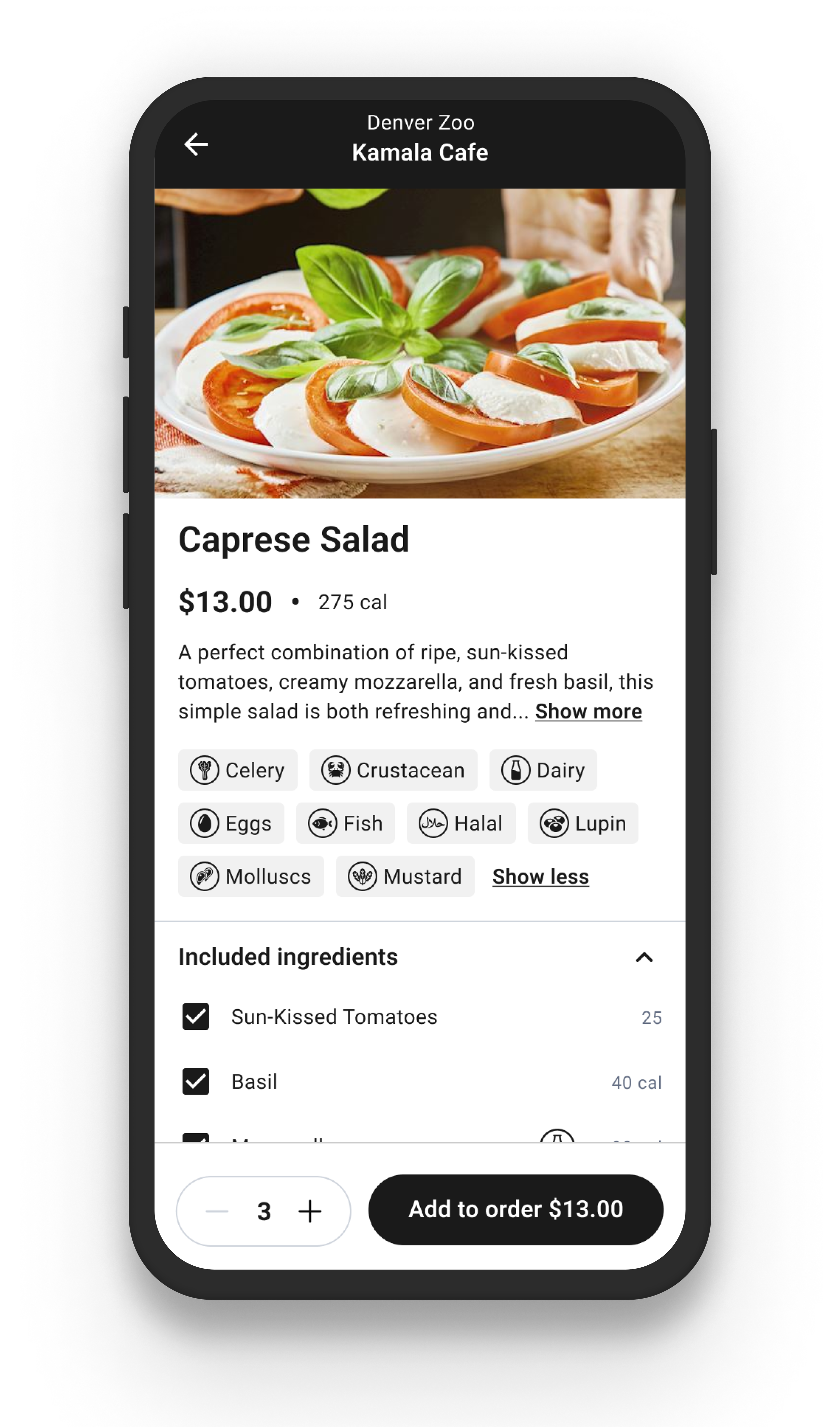

Kiosk ordering
After launching the mobile experience, our design team shifted focus to the kiosk experience. For restaurants, kiosks are a vital solution to help reduce wait times and address labor shortages. They also give guests a great alternative to mobile ordering, offering the privacy and contactless convenience many prefer over using a traditional register.
Using insights from the mobile experience, we brought the same core principles to the kiosk: a scalable, white-label solution for operators paired with an intuitive, guest-friendly design.
While many mobile design principles worked well for kiosks, we had to adapt for the larger touchscreen. This meant factoring in things like users’ field of vision, arm movements, affordance, and privacy to ensure the experience felt natural and comfortable.

Example of a customer using the kiosk at a local zoo.
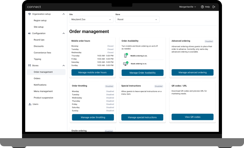
Giving full control to the
restaurant operator to manage the mobile and kiosk channels

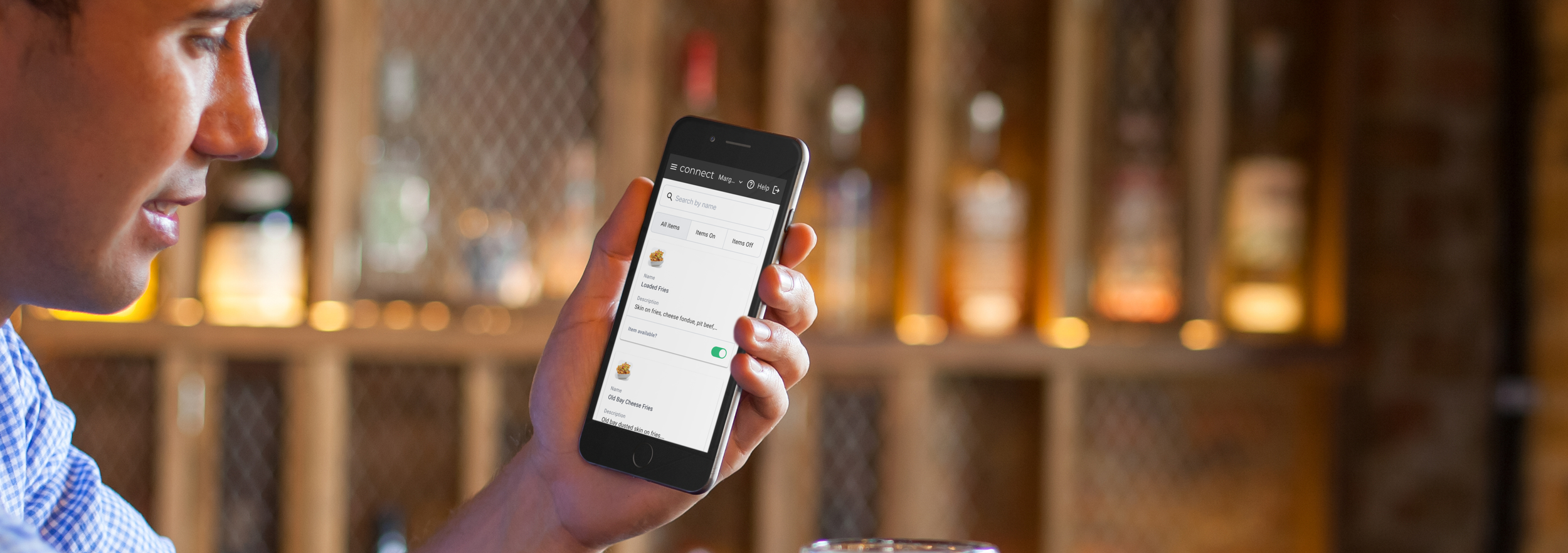
We knew operators needed a tool to easily manage their digital channels—from setting things up to handling orders, managing item availability, applying discounts, processing refunds, and more.
Through our research, we discovered that restaurant operators are always on the move. They rely on their mobile devices for most tasks but occasionally hop on a laptop when they need to run reports or handle bigger projects. With this in mind, we took a mobile-first design approach, ensuring the tool is easy to use on the go while still working seamlessly on larger screens when needed.